1雅思学术类雅思学术类 TASK 1TASK 1 范例:范例:You should spend 20 minutes on this task.The line graph below shows the birth and death rates per thousand population.Write a report describing the information shown below.You should write at least 150 words. 
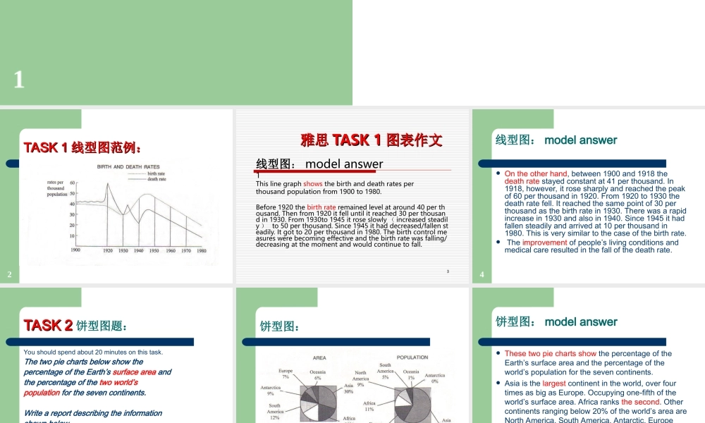
2TASK 1TASK 1 线型图范例:线型图范例: 3 雅思雅思 TASK 1TASK 1 图表作文图表作文线型图: model answer1This line graph shows the birth and death rates per thousand population from 1900 to 1980.Before 1920 the birth rate remained level at around 40 per thousand. Then from 1920 it fell until it reached 30 per thousand in 1930. From 1930to 1945 it rose slowly ( increased steadily ) to 50 per thousand. Since 1945 it had decreased/fallen steadily. It got to 20 per thousand in 1980. The birth control measures were becoming effective and the birth rate was falling/decreasing at the moment and would continue to fall. 4线型图: model answer On the other hand, between 1900 and 1918 the death rate stayed constant at 41 per thousand. In 1918, however, it rose sharply and reached the peak of 60 per thousand in 1920. From 1920 to 1930 the death rate fell. It reached the same point of 30 per thousand as the birth rate in 1930. There was a rapid increase in 1930 and also in 1940. Since 1945 it had fallen steadily and arrived at 10 per thousand in 1980. This is very similar to the case of the birth rate. The improvement of people’s living conditions and medical care resulted in the fall of the death rate. 5TASK 2TASK 2 饼型图题:You should spend about 20 minutes on this task.The two pie charts below show the percentage of the Earth’s surface area and the percentage of the two world’s population for the seven continents.Write a report descri...