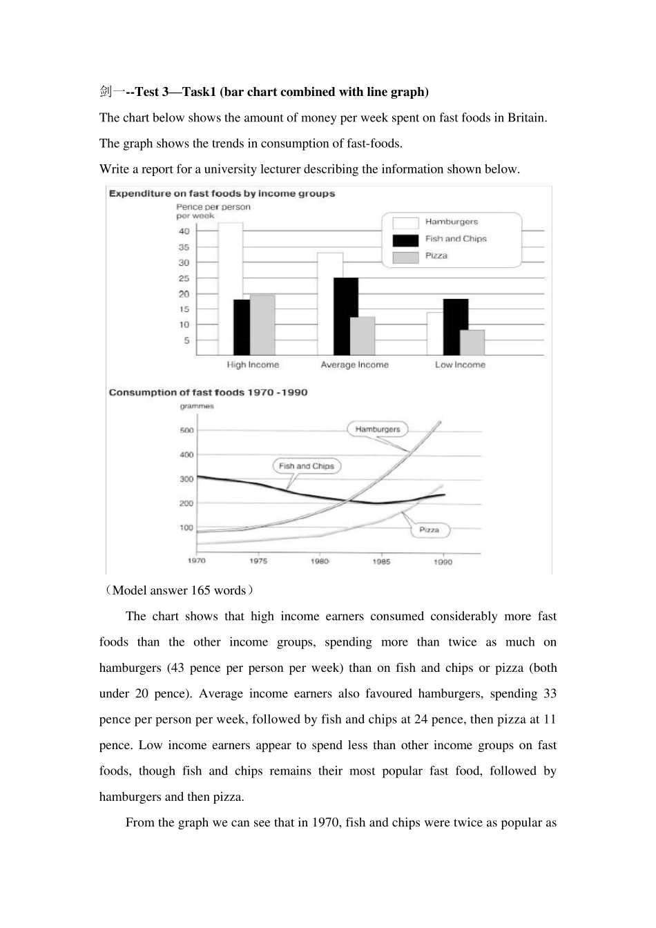
剑一--Test 3—Task1 (bar chart combined w ith line graph) The chart below shows the amount of money per week spent on fast foods in Britain
The graph shows the trends in consumption of fast-foods
Write a report for a university lecturer describing the information shown below
(Model answer 165 words) The chart shows that high income earners consumed considerably more fast foods than the other income groups, spending more than twice as much on hamburgers (43 pence per person per week) than on fish and chips or pizza (both under 20 pence)
Average income earners also favoured hamburgers, spending 33 pence per person per week, followed by fish and chips at 24 pence, then pizza at 11 pence
Low income earners appear to spend less than other income groups on fast foods, though fish and chips rem